Disclaimer of AI (non-)use: The writing in this blog is mine. Claude caught a half-dozen typos and built the CSS+HTML from my draft.
As a postdoc this semester, I've started to take on more teaching as a way to ease myself into a future faculty role (updates on this soon!), and have needed to create some new lecture material.
Confronted with a problem on the computer in 2026, the natural question is: can I get an LLM to solve it? Yet while many people, including (or especially?) academics, are using AI assistants for all parts of their job (including much I reckon they should not be used for), my impression is that most are still making their slides by hand.
This choice is understandable, perhaps preferable. Crafting a lecture or talk is a deliberate and rather painstaking process, and I'm very particular about structure and visualizations. As with other things I'm opinionated about (namely writing), I have been mostly unsatisfied with AI-assisted slide creation: the results were too text-heavy, with either no visualizations or very poor ones.
Of course, as with everything else, the models are improving rapidly at this task. In addition, it's clear that some tools or workflows work better than others. This past week, I taught a lecture on Bayesian inference for the bachelor's intro to AI course at the University of Zürich, and wanted to see how far I could get with AI tooling. This post details my process and is intended to serve as a rough guide for others interested in doing the same.1

How I would like to make lecture content
Putting together a talk or lecture, much like writing, is a way to clarify thinking and refine a narrative. A good lecture tells a story, and good stories are entertaining and coherent (see Jason Eisner's excellent advice on preparing technical talks). For instructional content, I try to deconstruct the logic of my own intuitions and understanding so that I can cleanly rebuild it over the course of the lecture.
If you're anything like me, however, it is easy to get hung up on small details when building slides (like figuring out the right color for a text box), and building even a simple deck takes many hours. These distractions get in the way of constructing and considering the larger narrative. While this behavior can manifest when writing (long searches for that mot juste), usually I find that by working out the correct phrasing, I simultaneously clarify my thoughts (as well as build cognitive muscle). The same is not true for PowerPoint wrangling. Perfectly aligning slide elements is just a pain in the ass; it's not character-building.
So, from my perspective—that is, one of an instructor—the ideal format for pedagogical material is the manually-written lecture note. It serves the dual purpose of making sure I understand the material myself and of communicating it to others. I suspect this preference holds true for other educators and explains the lecture note's persistence and ubiquity.2
The downside of lecture notes is that they are not necessarily the ideal format for the lecture itself. Yes, you could emulate my undergrad math professors, and read off the lecture notes while copying them on the chalkboard (to be then copied again by the students). And there remains a deep appeal for this format—for instance, it gives students the time to internalize complex derivations. But there are limitations: you're bottlenecked by the speed (and legibility) of your writing, and you still have to rely on slides (or natural artistic talent) for visuals.
Ideally, I want to write lecture notes first and have slides that follow that structure, meaning that my voice is retained throughout. While automatic creation of the slides wholesale would cheat me (and the audience) out of the deep understanding necessary to deliver a good lecture, fully manual creation can be extremely time-consuming.
I've tried using LLMs to create PowerPoint files (both with Claude and with Copilot), and was left a bit cold (see the end for some results, which are better than my previous experience a few months ago). The slides were mostly serviceable, but contained too much text and were rather sterile (they still struggle to make equations). I also suspect that directly crafting pptx XML is not an easy task,3 and presumably high-quality pptx files are not well-attested in the training data (most PowerPoints are awful to begin with, and good ones are mostly proprietary). Yes, the capabilities are improving every day, but are AI-generated PowerPoints something we even want?

My solution: playing to LLMs' strengths
LLMs see trillions of tokens of web data and can generate high-quality visualizations using various JavaScript frameworks.4 I use them to make graphs for papers, interactive tooling, etc. While they struggle with some tasks—namely abstract diagrams—they are often extremely capable.
The remaining issue, then, is how to package these into a presentation—visuals can't always stand on their own. Luckily, I recently came across a simple solution: reveal.js, a fully open "HTML presentation framework" (h/t to Chenhao Tan, who recently shared his NLP lecture materials on BlueSky).
While the reveal.js syntax seems simple enough, I wasn't that keen to learn and write it myself. Of course, there's an easy way around this problem now:
I'm hoping to do something a little bit different with a lecture. I have some latex notes, and I want to make them into slides with nice interactive elements/animations. For instance, I'd like to illustrate the beta-binomial using coin flips, with "ghost coins" for alpha and beta priors and density plots for the prior / likelihood / posterior. I have heard of the revealjs.com framework, which maybe is appropriate here. That way we get some built-in functionality, like using the latex as speaker notes on the slides. I'm attaching the latex, then let's go slide-by-slide and develop this?
It took another couple hours, on and off, to achieve a result I was satisfied with (using Claude Opus 4.6 with extended thinking in the web interface; I didn't see much need for Claude Code here). That said, after the second pass it was already very good. You can view the first part on the beta-binomial here (original LaTeX here, which I proofread with Claude). The second part, on Gaussian mixture models and expectation maximization, is here; it was based on some older notes and I think is slightly less successful since I didn't include visual cues in the notes.
The interactivity is of course the real highlight and I was very satisfied with the slides overall:
The deck starts at the interactive slide. To navigate from the beginning, press G then type 1.
Summarizing the lessons learned:
- The LLM may skip or reorder your content, and seems to prefer fewer slides than necessary unless otherwise instructed (this is more of an issue for PPTX generation).
- It also constantly skips steps in derivations, even if they're in the lecture notes.
- Specify the visualizations you want to see upfront in the lecture notes (e.g. with a LaTeX tag); if you don't, the results will generally be a bit too text-heavy.
- It's best to have a very clear picture in mind of what you want the visualization/interactivity to be. If you don't, it may look pretty but fail to communicate the lesson(s) you want it to.
- While the slides are usually balanced visually, sometimes there is too much content and they need to be broken up.
- The model will inject its own wording, especially for slide/section titles, which I often found too cutesy/not in my voice. I had to explicitly instruct it to stick to my own wording.
- I used slide numbers when asking for fixes, which usually worked, but I think the model may get confused as it requires manual counting (the resulting HTML contains comments that indicate the slide number).
- Plate diagrams (and I assume SVGs generally) were generally broken initially and never looked quite right.
- Minor thing: the HTML viewer for Claude doesn't play well with reveal.js, so it's best to download the file and open it in your browser.
Things I appreciated:
- I asked to sync my lecture notes as speaker notes, and it worked great (you need to run the built-in python web server to enable speaker view, which is dead simple).
- Interactivity tended to work well out of the box with no major bugs.
- Thanks to the reveal.js plumbing, the resulting HTML file is fairly succinct and easy to edit (interactive elements notwithstanding).
- The slides themselves are very pretty and the reveal animations happen at the right points, encompassing logical blocks.
Reflections on the Lecture and Process
Overall, I'm happy with how things went. My main concern was to avoid feeling like an imposter reading someone else's slides. Using lecture notes that were almost5 entirely my own, with a narrative and examples I designed, helped stave off that feeling. While the slides didn't have my personal touch (a little more on this below), I still felt an ownership over the content.
The first part of the lecture on the Beta-Binomial was especially successful; the students were engaged and asked good questions, and several followed-up with additional questions during the break. I think the interactive beta-binomial was a hit and I think (hope?) it improved students' intuition.
The main failures were attributable to teaching this class for the first time, not primarily the tech. It's a bit of a "zoo" course co-taught by several postdocs, covering broad themes in AI (roughly following Russell and Norvig). The second part of my lecture, on Gaussian mixture models and expectation maximization, is likely more fitting in an advanced undergraduate machine learning course, where maximum likelihood estimation is a consistent cornerstone. The material is rather difficult without that familiarity (it's also a four-hour block and attention waned—breaks only do so much). This issue touched on a greater problem with the slide format in general: there is little to slow you down.
Beyond that, the other issue is that abstract visuals remain a challenge (see notes on Gemini below for a possible solution). Even simple plate diagrams proved challenging, requiring multiple iterations and never looking quite right. It could be preferable to have an LLM write TikZ code directly, compile it, and use that, or just mock it up myself.
Anyone who has seen one of my talks also knows that I'm partial to "vintage" MS Office clipart (sprinkled throughout this post). Without it, I feel the slides were a little soulless. In the future, I'll probably include these manually after—perhaps it will be worth shelling out for a slides.com subscription to get a WYSIWYG editor, or I'll just edit the HTML myself.

Parting Thoughts
I am new to teaching and will continue to develop a system that works for me. For instance, as I was giving the lecture and writing this piece, I was drawn to the simplicity of the chalk-and-blackboard. There, you can easily extemporize—including more details in a derivation, making diagrams, etc. Slides lock you in to the structure and impose a steady marching pace. It may be that a hybrid approach is best—keeping the visualizations and interactivity of slides for visuals and sticking to the chalk/whiteboard for the math.
Next time, I suspect I'll also prompt the LLM with rough diagrams (complete with clipart) alongside the notes, and ask them to be included at the appropriate points. In fact, that's what I did for this blog post, and I think it worked well.
Technical details aside, the belief I had when I started still holds: there is no substitute for a carefully-crafted narrative.

Epilogue: the other options
After writing up this document I decided to take a second look at some alternatives. These results are not intended to be comprehensive or even fair comparisons, but are instead based on what I already have access to / what I would expect to work (e.g., I don't have a ChatGPT subscription so left it out entirely).
Takeaway: I like my handmade slides most, but the above notes+Claude+reveal.js workflow has the best time-to-quality ratio. The other AI tools are worse.
Artisanal, hand-crafted slides
I recently put together a 20-minute RLHF lecture for a faculty interview. Treating it as an upper-bound of my slide-creation / lecturing abilities, it is (mostly) superior to the reveal.js slides: animations for derivations, several diagrams. That said, it took me roughly five times as long and covers a fifth of the time.
Google Slides Gemini integration
Building on the intuition that you should play to the models' strengths, and that those strengths are a function of training data, we might expect Gemini to produce nice slides. However, the UX for the Gemini integration is extremely buggy and frustrating, and currently only produces one slide at a time. This was basically a non-starter, especially because the slides are static images and non-editable.
That said, for specific diagrams, it works well (ignoring this static image problem). I was recently putting together some slides on a mechanistic interpretability proposal, and had Gemini write detailed prompts for diagrams that I then passed to the integration in Slides:
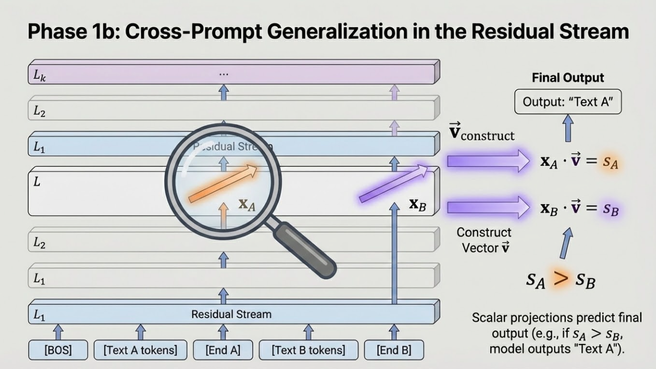
Not bad! For whatever reason, Gemini tends to produce fairly garish / maximalist diagrams (note the 3D blocks—a big no-no in modern design languages), but I kind of like it? They're at least coherent. If Google continues to invest in this space, I think this will be quite impressive going forward.
PowerPoint generated by the Claude chat interface
The result is much better than the last time I tried this setup, perhaps because it had the lecture notes as scaffolding. In fact, had I tried this first, I may well have stuck with it.
The slides are reasonably well-structured with a consistent, pleasant design language. Initially there were no visuals, but Claude created them after a follow-up request (and of course interactivity is impossible).6 Weirdly, however, there are no real formulae. Everything is written in either Unicode or a kind of pseudo-LaTeX. This oversight really hurts their utility in a learning context. Perhaps I could prompt Claude to improve this (I'm assuming it would also use images), but I hit my session limit.
PowerPoint using the Claude plugin
Anthropic provides a Claude plugin for PowerPoint, which makes it easy to edit the generated slides and iterate. Unfortunately, it's worse than the chat interface: no formulae, sort of ugly, and the visuals are completely wrong.
Copilot Plugin
The most obvious choice for AI-generated PowerPoints is the built-in Copilot plugin. The problems started immediately: I couldn't figure out how to upload my notes into the chat interface (I could only choose items from my OneDrive), so I just pasted them in as text. The first iteration was by far the worst of the attempts, literally just text on the page in the default font and far worse than a chalkboard talk. Copilot then suggested adding visuals, which pushed some elements off the page; it also created a separate python notebook for interactivity (which I didn't bother looking at). Bizarrely, Copilot also makes a separate file rather than working inside the open PowerPoint window. In all, extremely disappointing—I can see that if Copilot is all you've experienced, your opinion of AI is likely pretty bad!
Further reading: I found this ode to reveal.js that covers similar ground.